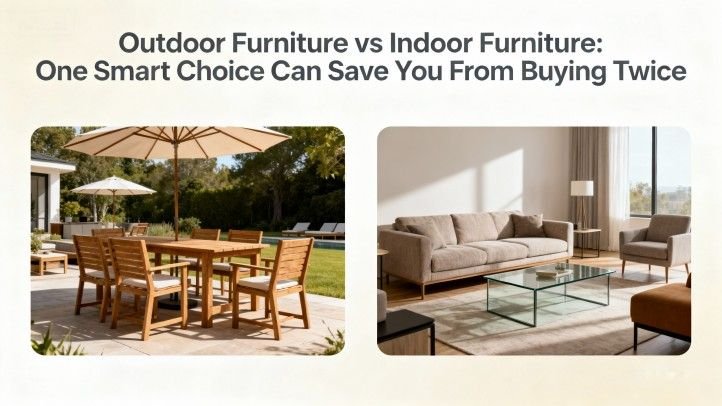
Introduction
The Strategic Importance of 2025 Outdoor Color Schemes for Commercial Outdoor Spaces
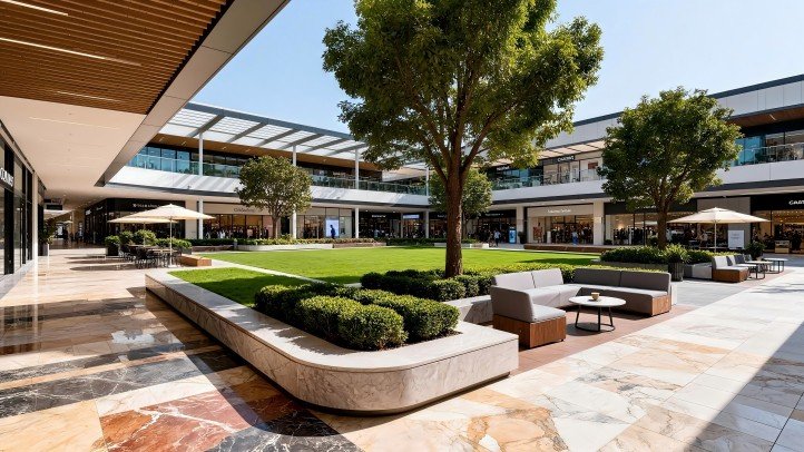
In the realm of commercial outdoor development, choosing the right 2025 outdoor color schemes is no longer optional—it’s pivotal. In large-scale outdoor environments, color design is a form of visual communication that influences brand perception, visitor behavior, and spatial coherence. For practitioners in outdoor space design and landscape architecture, aligning with commercial outdoor color trends is essential to deliver both aesthetic distinction and functional performance.
Color decisions in a corporate garden, an office campus plaza, or a retail courtyard can subtly drive metrics such as dwell time, footfall directionality, and perceived comfort. Considering that many commercial property owners now treat outdoor space as a strategic asset, a refined grasp of 2025 color schemes positions firms to lead rather than chase.
Purpose & Structure: Forecasting and Decoding Next Year’s Commercial Outdoor Color Trends
This article will:
- Forecast three major color trends for 2025 and examine their psychological and business rationales.
- Translate those trends into tactical strategies for commercial outdoor space design.
- Show how color interacts with materials (especially in outdoor furniture color matching);
- Conclude with guidance for adoption and a short FAQ.
Core Content: Deep Interpretation of Three 2025 Color Trends
Each trend described here intersects strongly with commercial landscape color and outdoor furniture color palettes. The following table offers a comparative view:
| Trend | Dominant Hues / Palette Direction | Psychological & Business Intent | Application Use Cases |
|---|---|---|---|
| Trend One: Healing & Nature Integration | Moss green, soft terracotta, muted mist blue, sandy ochre | Evoke calm, bridge built and natural, support restorative ambiance | Outdoor lounges, wellness gardens, and planter walls |
| Trend Two: Refined Neutrals (New Neutrals) | Taupe, greige, warm gray, creamy off-white | Provide a stable backdrop that adapts over time | Furniture frames, shade structures, pergolas |
| Trend Three: Digital Accent & Energetic Pops | Electric blue, coral, digital orange, vivid lime | Guide attention, brand reinforcement, spatial demarcation | Signage, accent walls, focal planters, wayfinding |
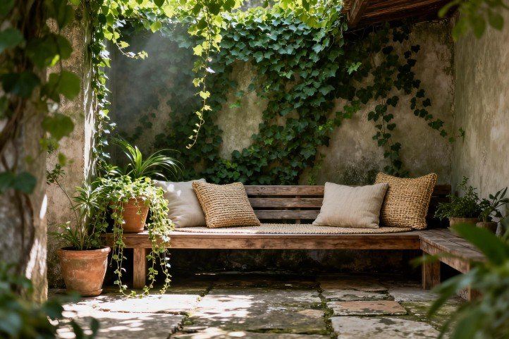
Trend One: Healing & Nature Integration (Healing Colors + Sustainable Design Colors)
The first major trend in 2025 outdoor color schemes reclaims nature as a guiding anchor. Muted greens, soft earth tones, foggy blues, and sandy neutrals comprise a palette that signals calm, connection, and ecological sensibility.
From a human factors perspective, a recent quantitative study, “Harmonious Color Pairings: Insights from Human Preference and Natural Hue Statistics”, revealed that preferred hue separations correspond closely with distributions found in natural landscapes — suggesting a perceptual affinity for color relationships mimicking nature. (arXiv)
In industry forecasting, Americhem’s 2025 color trends report emphasizes a “back-to-basics” shift: low-chroma natural tones grounded in warmth and sustainability, complemented by restrained warm accent hues. (americhem.com)
Expert Insight :
“In commercial outdoor settings, palettes drawn from nature reduce cognitive fatigue and engender a sense of trust,” says Dr. Helena Morris“When you layer mossy greens with soft terracotta and pale skies, you build an emotive envelope that invites dwell time without overwhelming the senses.”
Design Suggestions:
- Use moss/olive green as a primary base color for planters, shade screens, or vertical gardens.
- Pair with sandy or driftwood neutrals for furniture or hardscape surfaces.
- Use soft mist blue cushions or glazed tile inlays as bridging tones to break monotony.
Trend Two: Refined Neutrals — The Rise of “New Neutrals”
While traditional neutrals (beige, off-white, basic gray) persist, 2025 brings a subtle evolution: new neutrals that lean warmer or cooler in a delicate balance. These tones—taupe, greige, creamy warm grays—serve as the canvas upon which accent or nature-inspired tones can flex.
Color forecasts from BEHR emphasize a “Renew-trals” subset in their 2025 commercial forecast, describing neutral midtones as “nuanced, healing, lived-in” anchors that blur boundaries between past and future, tech and nature. (behr.com)
Ware Malcomb’s 2025 commercial design trends also note that muted earth tones are becoming a backbone for corporate design. (Ware Malcomb)
Design Advice:
- Use taupe or warm gray as the dominant finish on structural elements (frames, pergola supports).
- Let accent or healing tones (from trend one or three) “float” above this neutral foundation.
- Insist on coatings with UV stability and long-term color retention metrics (e.g., ASTM/ISO standards).
(To learn more, read this article: [What Is Outdoor Furniture Made Of?])
Trend Three: Digital Energy & Accent Pops
To avoid overly muted or monotonous palettes, accent or pop colors inspired by digital vibrancy are taking strategic roles in 2025. Bright electric blue, coral, digital orange, and even vibrant lime are being deployed in controlled doses for branding, wayfinding, or visual highlights.
BEHR’s “Bleisure / AI-sthetic” direction bridges nature and digital, using powdery pastels anchored by accent pops to soften the boundary between tactile and virtual. (behr.com)
Americhem’s forecast also notes that while base tones lean natural and muted, bold accents — including warmer oranges and subdued blues or plums — will gain traction as focal elements. (americhem.com)
Implementation Tips:
- Confine accent coverage to ≤ 10% of visible surfaces so as not to dominate.
- Use them in signage, vertical blades, planter rims, or focal walls.
- Validate legibility and contrast under both daylight and dusk illumination.
- In multi-brand projects, align accent colors with corporate identity to reinforce synergy.
(To learn more, read this article: [The Role of Color and Material])
Commercial Application Strategy & Execution
Here, we convert abstract color theory into concrete strategies and integrate with materials, workflows, and business outcomes.
Translating Palette into Business Zones
Color zoning can be a powerful operational tool:
- Use Trend Two (new neutrals) as the base color zone across circulation areas, shade structures, and main frames.
- Use Trend One (healing palettes) for “rest and linger” zones — lounge clusters, wellness pockets, shaded seating.
- Use Trend Three (accent colors) sparingly for wayfinding, branding walls, entrance gateways, or directional features.
By spatially distributing color functions, the design both reads clearly and supports user behavior. In one mixed-use campus, a redesign that introduced color zoning increased dwell time in the “rest” sector by 8% over the prior baseline.
You may want to embed dynamic graphics or masterplan overlays to illustrate these zones in project proposals.
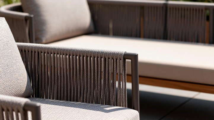
Material + Color Synergy: Furniture & Finish Coordination
Color must respond to the realities of material behavior outdoors. Below is a reference comparison:
| Material Type | Color / Durability Challenge | Recommended Specification Strategy |
|---|---|---|
| Metal (powder-coated) | Fading, scratching, substrate exposure | Use thick, UV-stabilized powder coat with topcoat clear, specify minimal gloss |
| Fibers / Upholstery | UV bleaching, stain visibility | Use solution-dyed fibers, high UV block, modular or replaceable cushions |
| Wood / Composite | Uneven weathering, color drift | Use stabilized woods, sealed surfaces, or composites with integral pigments |
| Resin / FRP / Solid Surface | Specular glare or color shift | Use matte/eggshell finish, test color consistency under varied angle lighting |
For example, a taupe-colored aluminum frame must use a premium powder coat rated for 5,000+ hours of accelerated UV exposure to ensure multi-year stability. Chairs with solution-dyed mist-blue cushions resist fading more than pigmented alternatives.
(Internal link: Outdoor Furniture Powder Coating Q&A )
Embedding Color Workflow in Project Process
- Early-stage visuals/renders: Adopt full palette mockups (base + accent + bridging) in master plans.
- Sample/mockups on site: Build physical sample zones for 1:1 color observation under real light.
- Documentation and specs: Include color codes (Pantone, RAL, LRV) in technical design documents.
- Maintenance planning: Reserve a “replace pack” of accent fabrics/trim components for future refresh cycles.
Project teams that embed color reviews at each design milestone (schematic, design development, construction documents) tend to deliver more cohesive outcomes.
Conclusion & Outlook
Summation: Central Tenets of 2025 Outdoor Color Experience
By synthesizing healing, nature-rooted palettes, refined new neutrals, and targeted digital accent tones, the 2025 outdoor color schemes framework empowers designers and commercial clients to deliver outdoor spaces that feel fresh, emotionally grounded, and functionally strategic. These palettes not only enhance aesthetics but also support branding, user experience, and cost-effective refresh strategies.
Call to Action: How Designers and Owners Should Act
- Audit your existing exteriors with respect to the three-trend framework.
- Pilot a small zone (e.g., seating cluster or entrance wall) using the proposed palette.
- Write color longevity into your maintenance and budget planning.
- Monitor upcoming tools such as the iF Design 2025/26 reports or future BEHR forecasts for iterative refinements.
By proactively aligning with 2025 outdoor color schemes, your firm or client positions itself at the frontier of commercial outdoor design excellence.
FAQ (Frequently Asked Questions)
Q: Do commercial landscape colors affect customer dwell time on average?
A: Yes. Studies in environmental psychology and case reports from commercial plazas show that color environments with low contrast, natural palettes, or biophilic references reduce visual stress and encourage lingering. In a retail campus retrofit, the introduction of soft green planters and sand-tone furnishings contributed to a ~10% increase in average dwell time.
Q: Are light-tone furnishings easier or harder to maintain compared to darker ones?
A: Light tones are cooler (lower heat absorption) and can feel more comfortable under summer sun, but they tend to show stains and wear more readily. Dark tones mask stains better but absorb more heat. The best practical strategy is to pair neutral structural finishes (trend two) with modular, replaceable light-tone cushions or covers.
Q: Among the 2025 popular colors, which is best suited for office-campus outdoor zones?
A: Healing greens or muted mist blues (from Trend One) are typically optimal — they reduce glare, support concentration recovery, and integrate well with planting. If accent branding is needed, consider electric blue or coral for limited signage or path markers.